
Branding case study
Superhero®
An identity for the hotel where founders land in San Francisco.
The brief
Superhero is a hotel and community space on Sutter Street, San Francisco, built for startup founders by startup founders. A room, a desk, and a straight line into the city's builder ecosystem: residencies, demo days, and access to Frontier Tower, a 16 floor community of 700+ builders.
Their promise is proximity. Land on day one, live next to someone who just closed a round, skip the year of cold intros. That story needed an identity founders would trust at first sight: confident, insider, zero corporate hotel polish.
They came to us for the brand. The name was theirs, the building was theirs, the website was theirs. Everything the brand had to look and sound like was ours.
What we made
Identity system
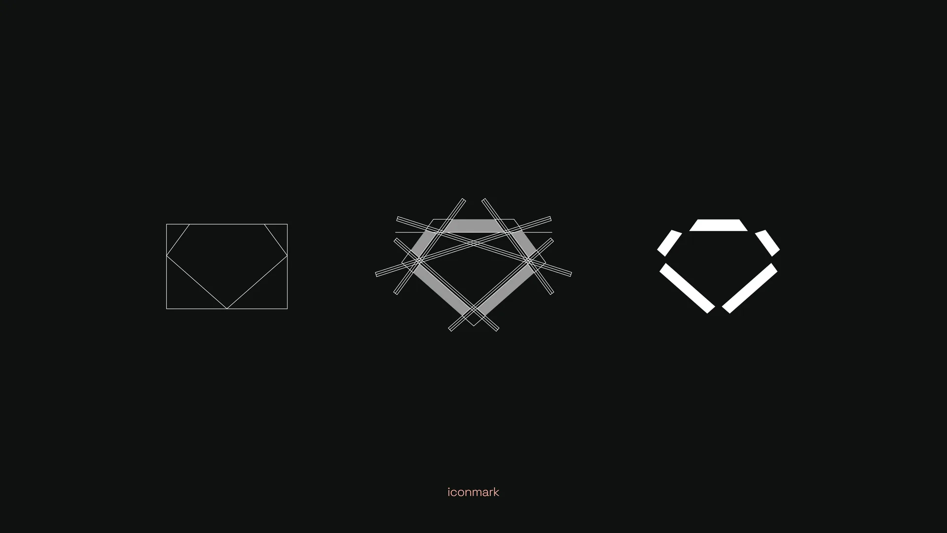
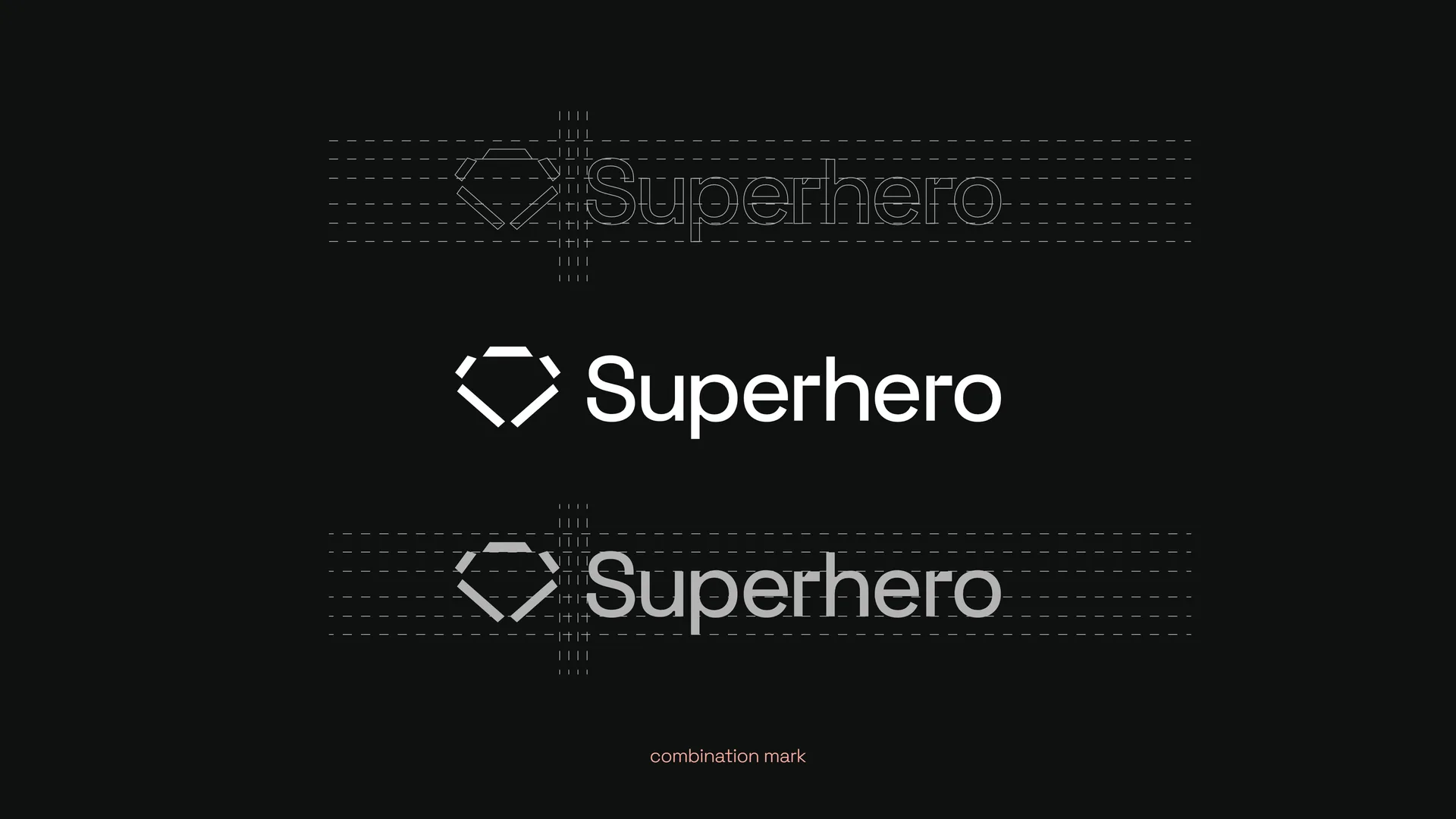
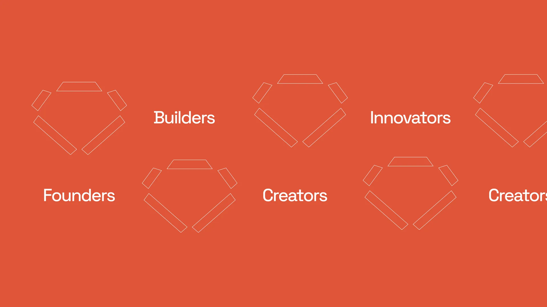
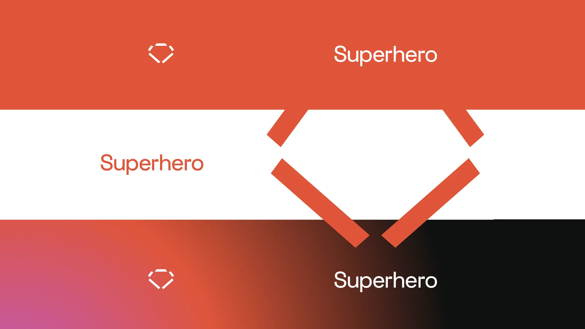
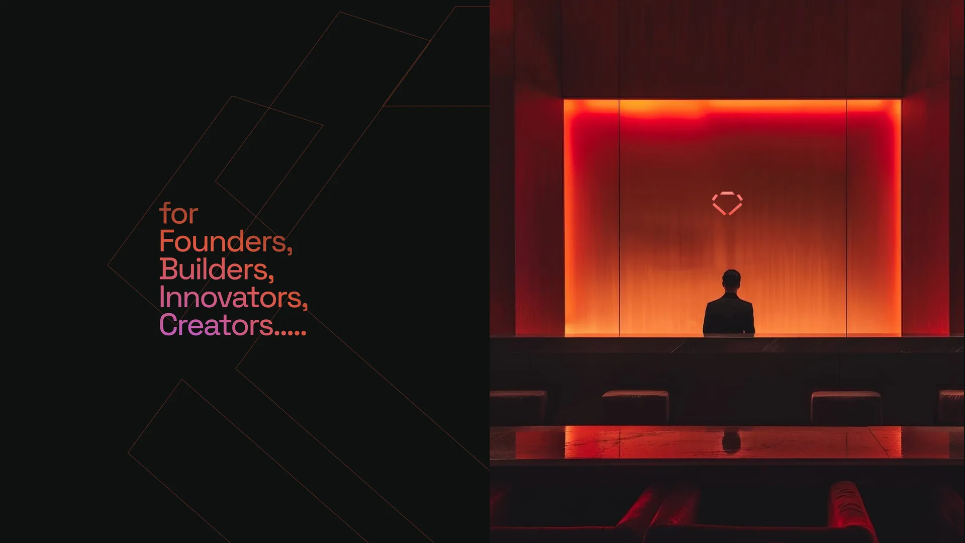
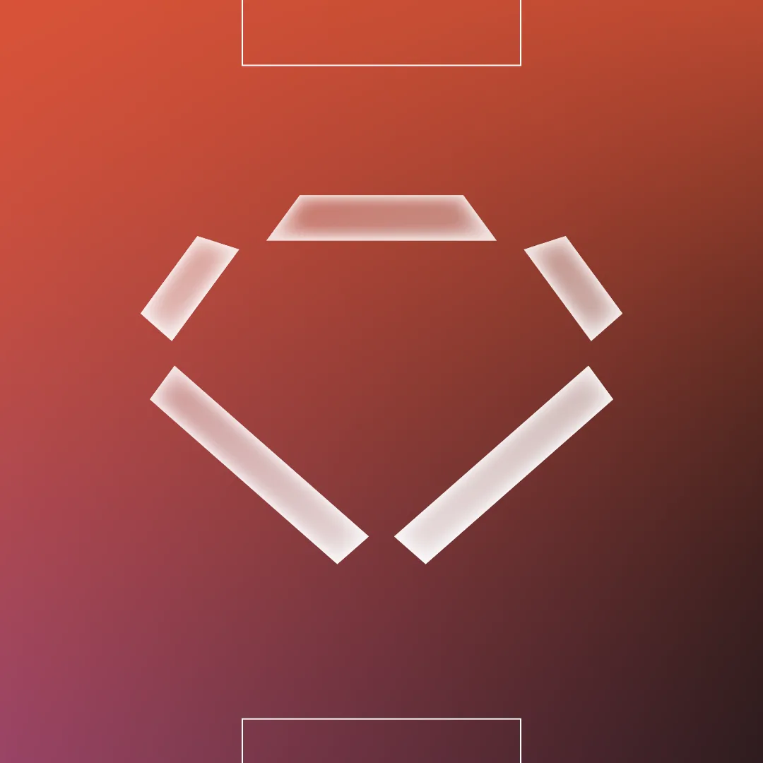
The emblem, six cut strokes drawn on a construction grid, plus the combination mark and wordmark.
Color and gradients
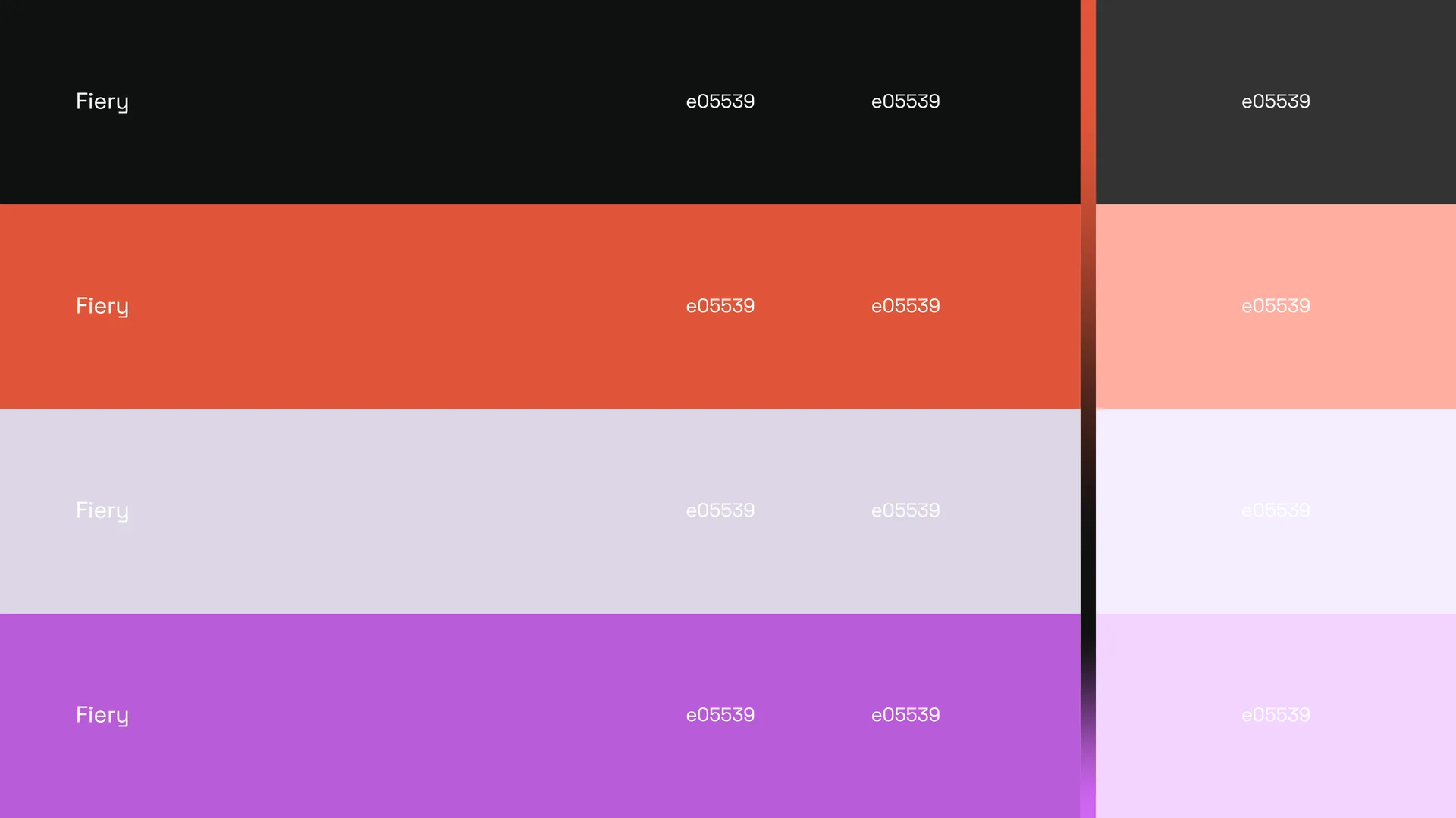
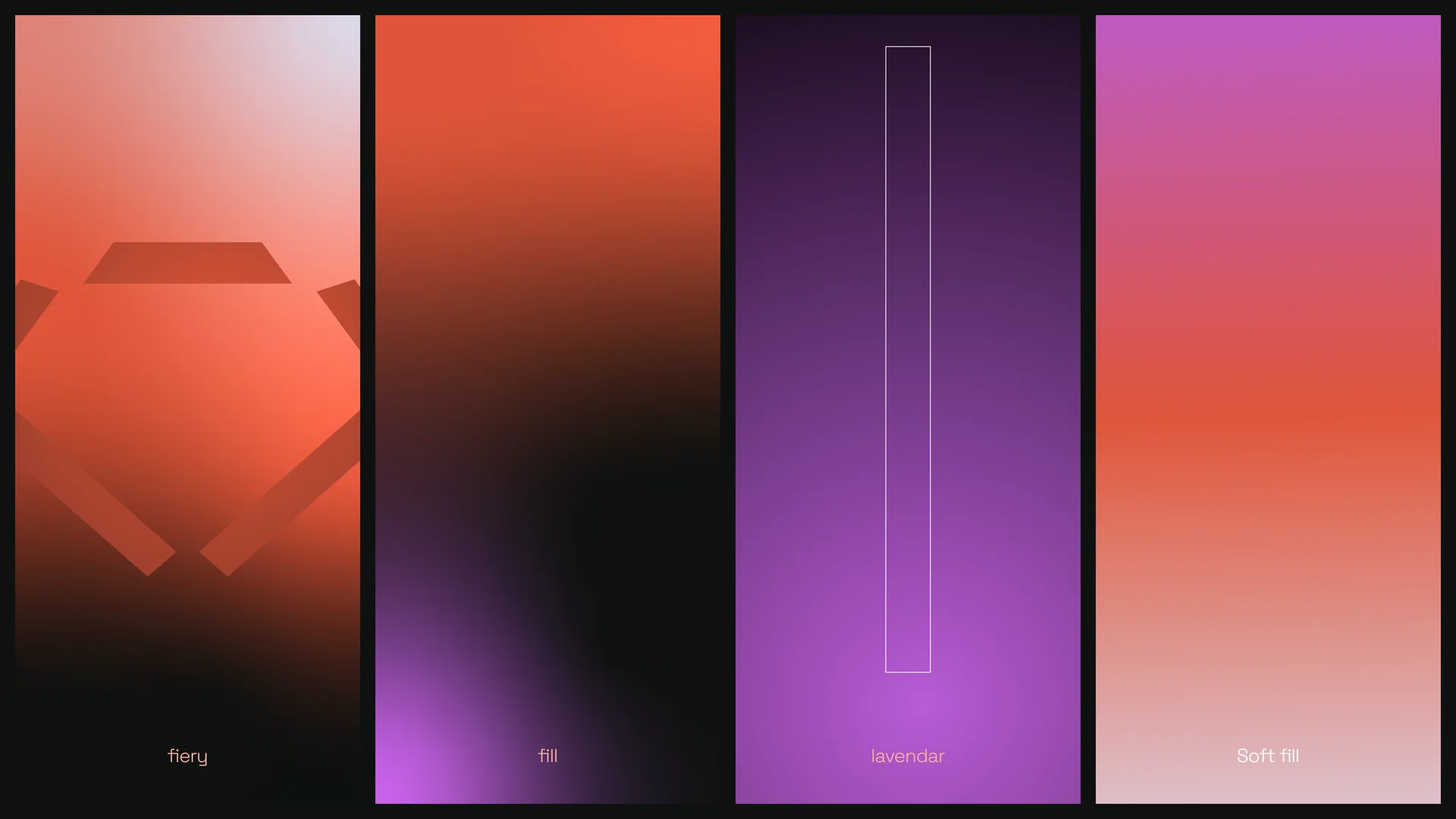
Fiery e05539 with charcoal and lavender, and the luminous gradient fills that carry the brand.
Typography
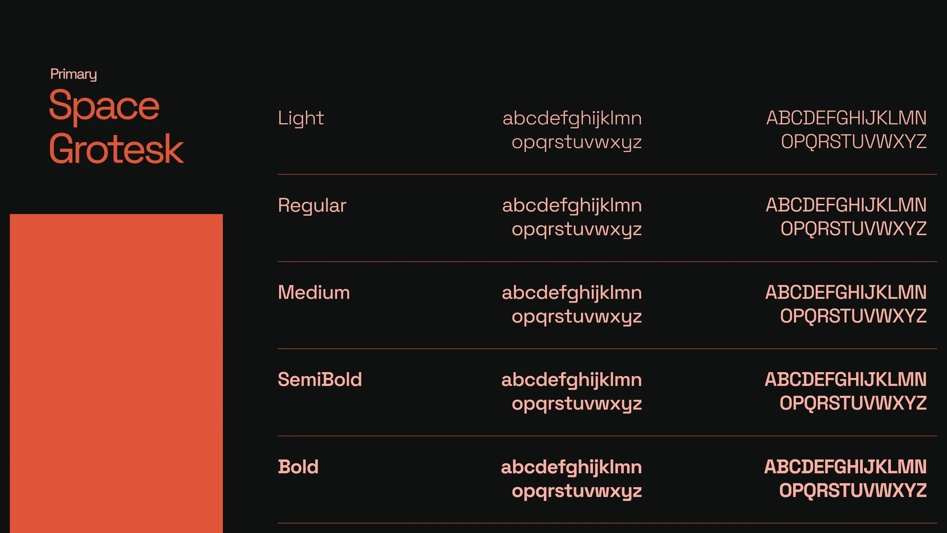
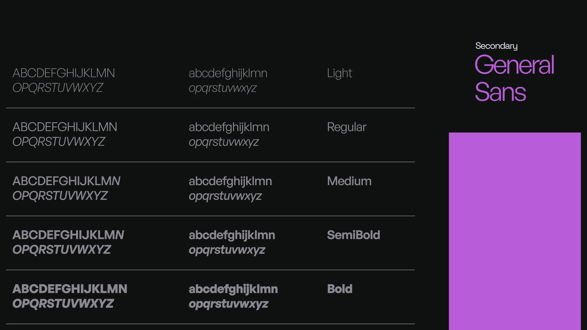
Space Grotesk leads, General Sans seconds. Type that reads tech and hospitality at once.
Motion
The logo build, the reveal, and the banner loop.
Applications
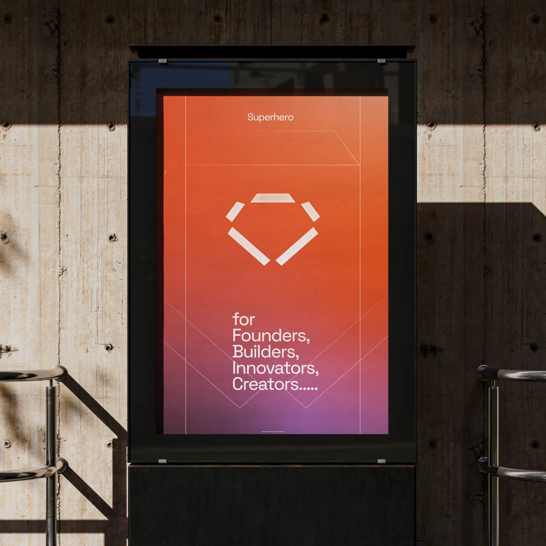
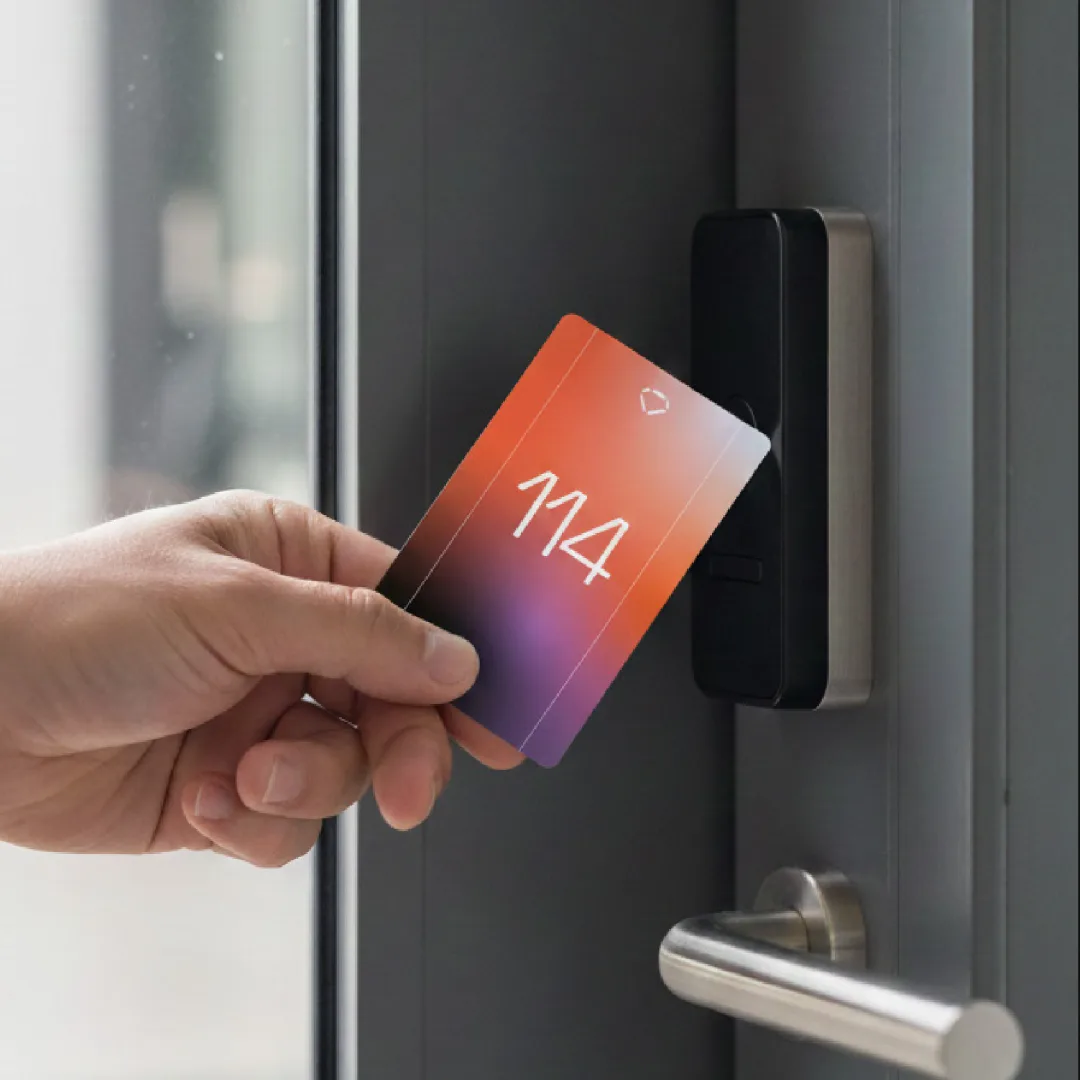
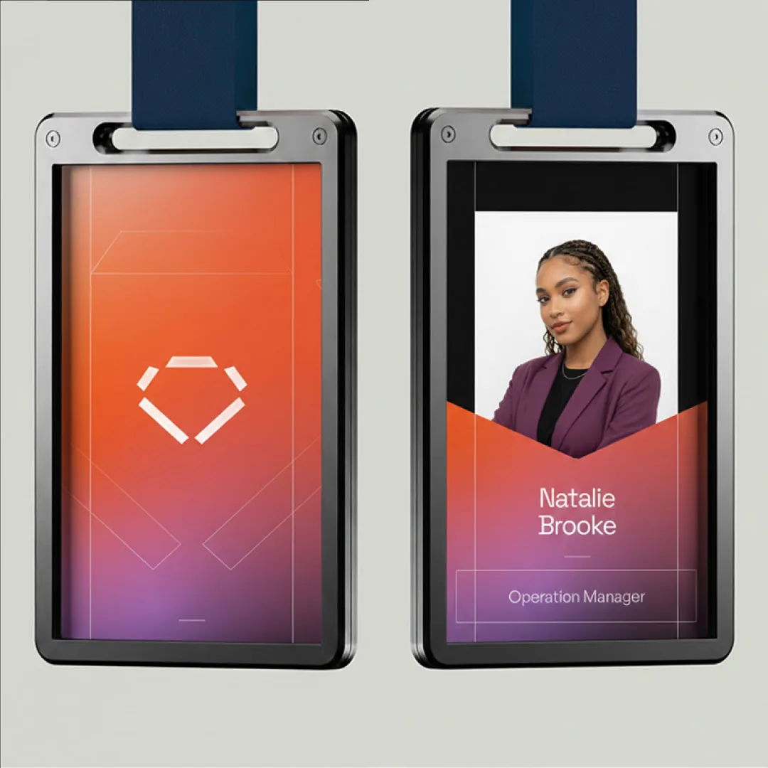
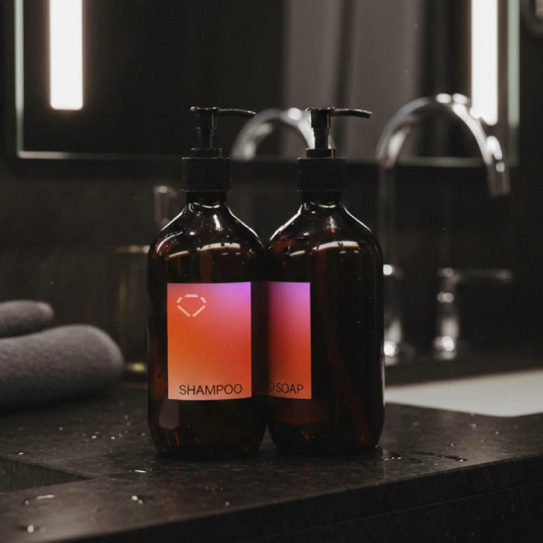
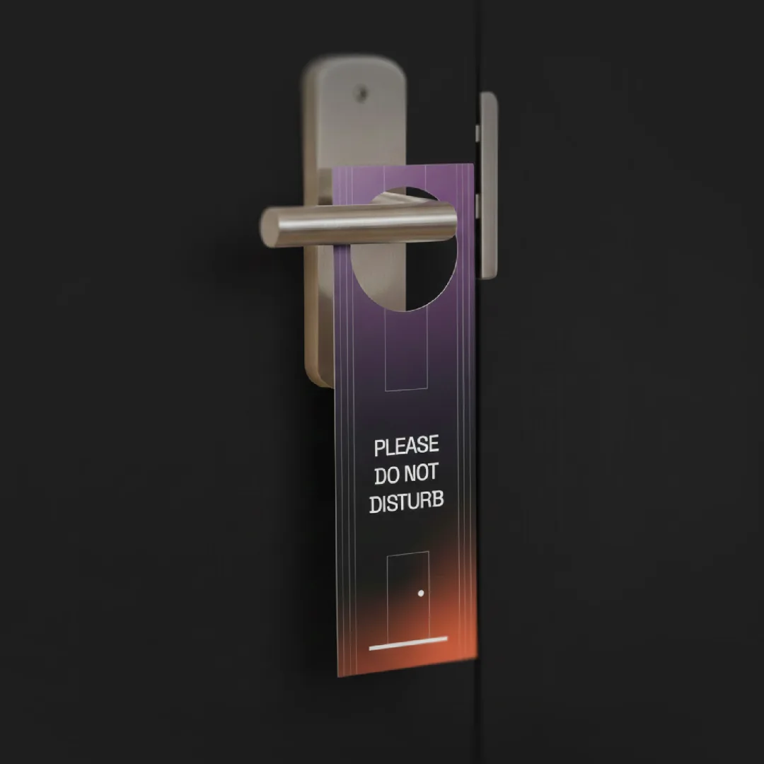
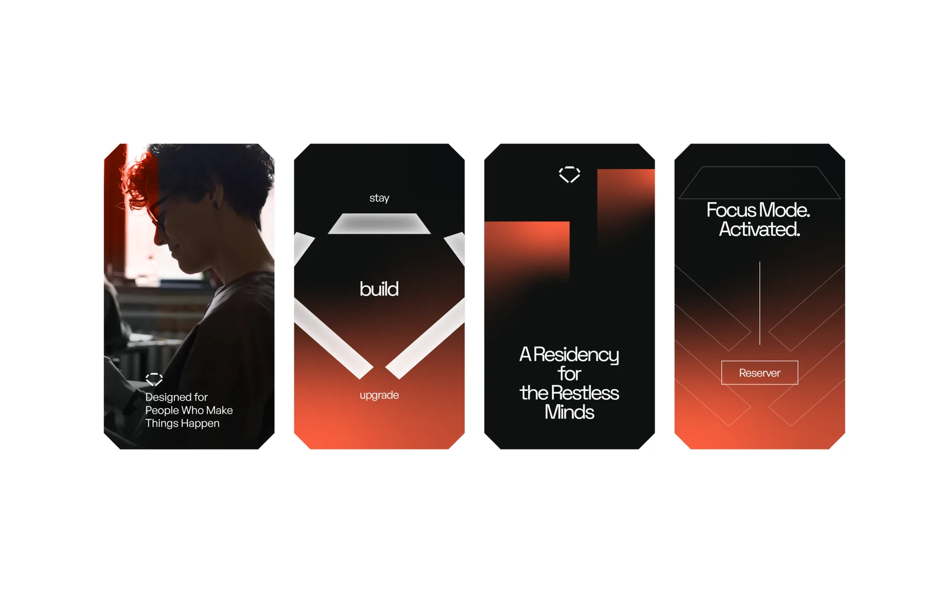
Staff badges, key cards, amenities, door hangers, street posters, and the social system.
Brand guidelines
A 27 page book so the identity survives contact with real life.
The work
The receipt
The identity shipped. What it earns from here, rooms filled, residencies booked, rounds closed upstairs, those numbers belong to Superhero, not to us.
What we can show is the system itself, above. When their numbers become public receipts, they land on this page the way everything lands here: real, or not at all.